W3cubDocs
/AngularAttribute directives
Change the appearance or behavior of DOM elements and Angular components with attribute directives.
See the live example for a working example containing the code snippets in this guide.
Building an attribute directive
This section walks you through creating a highlight directive that sets the background color of the host element to yellow.
-
To create a directive, use the CLI command
ng generate directive.ng generate directive highlight
The CLI creates
src/app/highlight.directive.ts, a corresponding test filesrc/app/highlight.directive.spec.ts, and declares the directive class in theAppModule.The CLI generates the default
src/app/highlight.directive.tsas follows:import { Directive } from '@angular/core'; @Directive({ selector: '[appHighlight]' }) export class HighlightDirective { }The
@Directive()decorator's configuration property specifies the directive's CSS attribute selector,[appHighlight]. -
Import
ElementReffrom@angular/core.ElementRefgrants direct access to the host DOM element through itsnativeElementproperty. -
Add
ElementRefin the directive'sconstructor()to inject a reference to the host DOM element, the element to which you applyappHighlight. -
Add logic to the
HighlightDirectiveclass that sets the background to yellow.import { Directive, ElementRef } from '@angular/core'; @Directive({ selector: '[appHighlight]' }) export class HighlightDirective { constructor(private el: ElementRef) { this.el.nativeElement.style.backgroundColor = 'yellow'; } }
Directives do not support namespaces.
<p app:Highlight>This is invalid</p>
Applying an attribute directive
-
To use the
HighlightDirective, add a<p>element to the HTML template with the directive as an attribute.<p appHighlight>Highlight me!</p>
Angular creates an instance of the HighlightDirective class and injects a reference to the <p> element into the directive's constructor, which sets the <p> element's background style to yellow.
Handling user events
This section shows you how to detect when a user mouses into or out of the element and to respond by setting or clearing the highlight color.
-
Import
HostListenerfrom '@angular/core'.import { Directive, ElementRef, HostListener } from '@angular/core'; -
Add two event handlers that respond when the mouse enters or leaves, each with the
@HostListener()decorator.@HostListener('mouseenter') onMouseEnter() { this.highlight('yellow'); } @HostListener('mouseleave') onMouseLeave() { this.highlight(''); } private highlight(color: string) { this.el.nativeElement.style.backgroundColor = color; }
Subscribe to events of the DOM element that hosts an attribute directive, the <p> in this case, with the @HostListener() decorator.
The handlers delegate to a helper method,
highlight(), that sets the color on the host DOM element,el.
The complete directive is as follows:
@Directive({
selector: '[appHighlight]'
})
export class HighlightDirective {
constructor(private el: ElementRef) { }
@HostListener('mouseenter') onMouseEnter() {
  this.highlight('yellow');
}

@HostListener('mouseleave') onMouseLeave() {
  this.highlight('');
}

private highlight(color: string) {
  this.el.nativeElement.style.backgroundColor = color;
}
} The background color appears when the pointer hovers over the paragraph element and disappears as the pointer moves out.
Passing values into an attribute directive
This section walks you through setting the highlight color while applying the HighlightDirective.
-
In
highlight.directive.ts, importInputfrom@angular/core.import { Directive, ElementRef, HostListener, Input } from '@angular/core'; -
Add an
appHighlight@Input()property.@Input() appHighlight = '';
The
@Input()decorator adds metadata to the class that makes the directive'sappHighlightproperty available for binding. -
In
app.component.ts, add acolorproperty to theAppComponent.export class AppComponent { color = 'yellow'; } -
To simultaneously apply the directive and the color, use property binding with the
appHighlightdirective selector, setting it equal tocolor.<p [appHighlight]="color">Highlight me!</p>
The
[appHighlight]attribute binding performs two tasks:- Applies the highlighting directive to the
<p>element - Sets the directive's highlight color with a property binding
- Applies the highlighting directive to the
Setting the value with user input
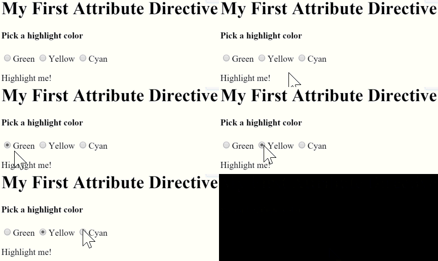
This section guides you through adding radio buttons to bind your color choice to the appHighlight directive.
-
Add markup to
app.component.htmlfor choosing a color as follows:<h1>My First Attribute Directive</h1> <h2>Pick a highlight color</h2> <div> <input type="radio" name="colors" (click)="color='lightgreen'">Green <input type="radio" name="colors" (click)="color='yellow'">Yellow <input type="radio" name="colors" (click)="color='cyan'">Cyan </div> <p [appHighlight]="color">Highlight me!</p>
-
Revise the
AppComponent.colorso that it has no initial value.export class AppComponent { color = ''; } -
In
highlight.directive.ts, reviseonMouseEntermethod so that it first tries to highlight withappHighlightand falls back toredifappHighlightisundefined.@HostListener('mouseenter') onMouseEnter() { this.highlight(this.appHighlight || 'red'); } -
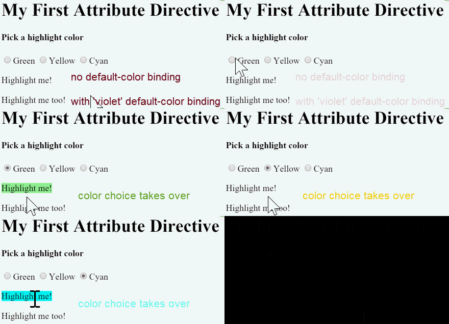
Serve your application to verify that the user can choose the color with the radio buttons.

Binding to a second property
This section guides you through configuring your application so the developer can set the default color.
-
Add a second
Input()property toHighlightDirectivecalleddefaultColor.@Input() defaultColor = '';
-
Revise the directive's
onMouseEnterso that it first tries to highlight with theappHighlight, then with thedefaultColor, and falls back toredif both properties areundefined.@HostListener('mouseenter') onMouseEnter() { this.highlight(this.appHighlight || this.defaultColor || 'red'); } -
To bind to the
AppComponent.colorand fall back to "violet" as the default color, add the following HTML. In this case, thedefaultColorbinding doesn't use square brackets,[], because it is static.<p [appHighlight]="color" defaultColor="violet"> Highlight me too! </p>
As with components, you can add multiple directive property bindings to a host element.
The default color is red if there is no default color binding. When the user chooses a color the selected color becomes the active highlight color.

Deactivating Angular processing with NgNonBindable
To prevent expression evaluation in the browser, add ngNonBindable to the host element. ngNonBindable deactivates interpolation, directives, and binding in templates.
In the following example, the expression {{ 1 + 1 }} renders just as it does in your code editor, and does not display 2.
<p>Use ngNonBindable to stop evaluation.</p>
<p ngNonBindable>This should not evaluate: {{ 1 + 1 }}</p>
Applying ngNonBindable to an element stops binding for that element's child elements. However, ngNonBindable still lets directives work on the element where you apply ngNonBindable. In the following example, the appHighlight directive is still active but Angular does not evaluate the expression {{ 1 + 1 }}.
<h3>ngNonBindable with a directive</h3>
<div ngNonBindable [appHighlight]="'yellow'">This should not evaluate: {{ 1 +1 }}, but will highlight yellow.
</div>
If you apply ngNonBindable to a parent element, Angular disables interpolation and binding of any sort, such as property binding or event binding, for the element's children.
© 2010–2023 Google, Inc.
Licensed under the Creative Commons Attribution License 4.0.
https://angular.io/guide/attribute-directives