W3cubDocs
/pandas 2pandas.plotting.scatter_matrix
- pandas.plotting.scatter_matrix(frame, alpha=0.5, figsize=None, ax=None, grid=False, diagonal='hist', marker='.', density_kwds=None, hist_kwds=None, range_padding=0.05, **kwargs)[source]
-
Draw a matrix of scatter plots.
- Parameters:
-
- frame:DataFrame
- alpha:float, optional
-
Amount of transparency applied.
- figsize:(float,float), optional
-
A tuple (width, height) in inches.
- ax:Matplotlib axis object, optional
- grid:bool, optional
-
Setting this to True will show the grid.
- diagonal:{‘hist’, ‘kde’}
-
Pick between ‘kde’ and ‘hist’ for either Kernel Density Estimation or Histogram plot in the diagonal.
- marker:str, optional
-
Matplotlib marker type, default ‘.’.
- density_kwds:keywords
-
Keyword arguments to be passed to kernel density estimate plot.
- hist_kwds:keywords
-
Keyword arguments to be passed to hist function.
- range_padding:float, default 0.05
-
Relative extension of axis range in x and y with respect to (x_max - x_min) or (y_max - y_min).
- **kwargs
-
Keyword arguments to be passed to scatter function.
- Returns:
-
- numpy.ndarray
-
A matrix of scatter plots.
Examples
>>> df = pd.DataFrame(np.random.randn(1000, 4), columns=['A','B','C','D'])
>>> pd.plotting.scatter_matrix(df, alpha=0.2)
array([[<Axes: xlabel='A', ylabel='A'>, <Axes: xlabel='B', ylabel='A'>,
        <Axes: xlabel='C', ylabel='A'>, <Axes: xlabel='D', ylabel='A'>],
       [<Axes: xlabel='A', ylabel='B'>, <Axes: xlabel='B', ylabel='B'>,
        <Axes: xlabel='C', ylabel='B'>, <Axes: xlabel='D', ylabel='B'>],
       [<Axes: xlabel='A', ylabel='C'>, <Axes: xlabel='B', ylabel='C'>,
        <Axes: xlabel='C', ylabel='C'>, <Axes: xlabel='D', ylabel='C'>],
       [<Axes: xlabel='A', ylabel='D'>, <Axes: xlabel='B', ylabel='D'>,
        <Axes: xlabel='C', ylabel='D'>, <Axes: xlabel='D', ylabel='D'>]],
      dtype=object)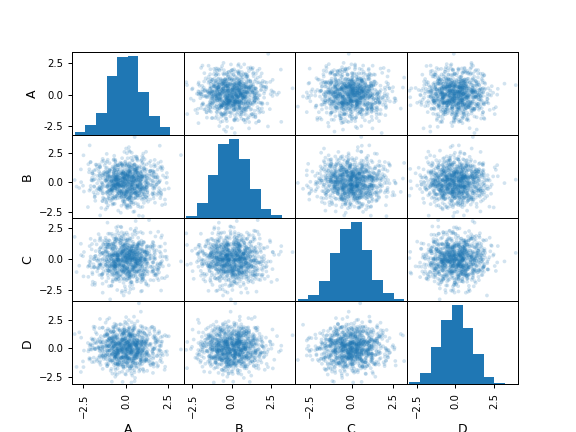
© 2008–2011, AQR Capital Management, LLC, Lambda Foundry, Inc. and PyData Development Team
© 2011–2025, Open source contributors
Licensed under the 3-clause BSD License.
https://pandas.pydata.org/pandas-docs/version/2.3.0/reference/api/pandas.plotting.scatter_matrix.html